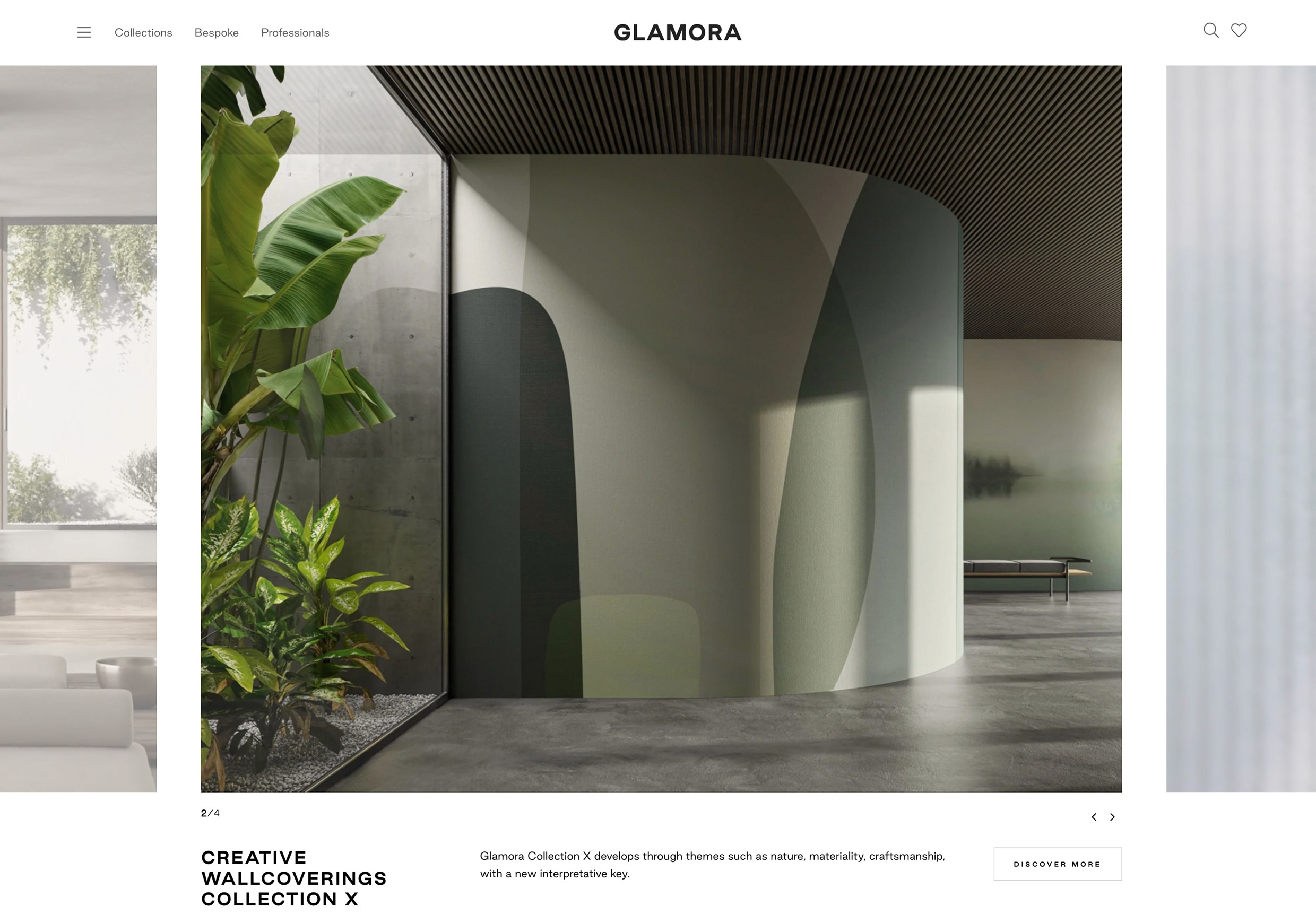
Glamora is an Italian brand that designs high-end, made-to-measure wallcoverings, elegant, refined, and sometimes even waterproof (yes, shower wallpapers are a thing).
Every product is part of a seasonal collection and delivered as a custom graphic composition, printed on two perfectly aligned panels… more couture than catalogue.
UX/UI DESIGNER
The Challenge
Glamora’s catalog was growing fast: hundreds of products, multiple collections each year, and an ever-evolving range of custom materials.
Their website, however, wasn’t keeping up.
It didn’t reflect the sophistication of the brand, nor did it support the practical complexity behind their offering.
Users struggled to browse collections, understand how each decor worked (especially the two-panel composition), and grasp the technical innovation without getting lost in jargon or losing the sense of inspiration.
The real challenge? Create a digital experience that felt editorial, tactile and navigable. All at once.
A website that could behave like a design showroom, not a spreadsheet in disguise.
The Strategy
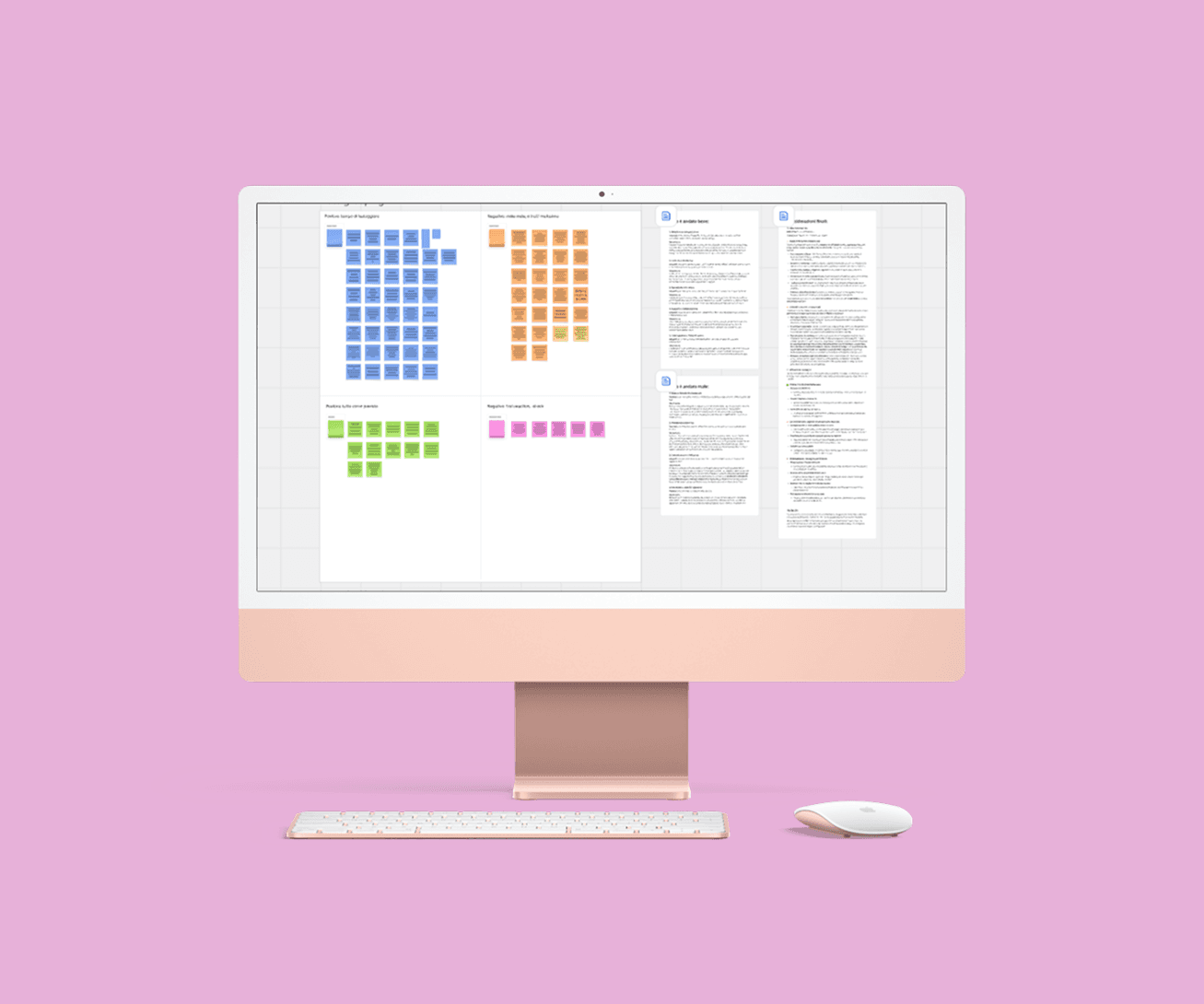
We started by mapping the unknowns. The brief was high-level, and we needed to deeply understand the internal ecosystem before making UX decisions.
We ran:
Interviews across departments to uncover business needs
Benchmarks to study competitors and parallels from fashion and interior design
Internal workshops to identify user pain points and functional
This groundwork helped us define: an ecosystem map of Glamora’s offering, key personas and user stories and last but not least a prioritized structure to support both emotional discovery and efficient browsing.
With this in place, we moved on to the concept phase.
Our UX goals focused on:
Making product collecting easy to browse, without overwhelming the user
Clarifying how each wallcovering is composed (two matched panels, one full decor)
Communicating the technical innovation behind the materials, without making the site feel cold or industrial
Every decision, from the information architcture to the UI system, was driven by the same question: "How do we make digital space feel as tactile, curated, and alive as Glamora's physical catalogs?"
The Result
The final delivery helped bring structure and clarity to a highly complex product universe.
The product page was designed to guide users through every essential detail, from the two-panel structure to material options, without losing elegance or overwhelming the experience.
One of the biggest wins was the navigation system: despite the sheer size of the catalog, the site now allows users to explore collections intuitively, without friction or confusion.
Beyond the result itself, this project marked a turning point for me.
It was the first time I truly understood how UX isn't just about flows or buttons, it's about making complexity feel effortless.
And that thoughtful design can live where beauty and structure meet.
The client was genuinely satisfied, and the process proved how much a clear analytical phase (combined with good teamwork) can elevate the final experience.
A special thanks to the team at ThinkingAbout, for trusting me such a layered project and giving me space to grow inside it.